
year
2025
timeline
1 month
project
add a feature to an existing app
role
client
Background
Problem
Solution
“Shuffle plays the same 10–15 songs, even in huge playlists. It doesn’t feel random at all.”
Kate
“I just want it to feel like Spotify understands my mood, not just my play history.”
Daniel
“I want to hear the full range of what I’ve saved, not just what I’ve played recently.”
Anthony
“I’d love to mix genres, like hip hop and R&B together, depending on my mood.”
Zach

Initial brainstorming kept the core insights separate: resurfacing long-unheard saved songs, maintaining discovery based on saved genres, allowing multiple genre/mood selections (Spotify currently limits this to one), and giving users control over whether current favorites were included or deprioritized. Early concepts treated these as distinct features.
I eventually funneled them into one layered feature: Smart Shuffle Filters. A second feature had also been in development: a "vibe check" where users could rate each song as good, meh, or bad to further influence the algorithm over time. After careful consideration, I cut it. Smart Shuffle Filters was already layered enough to address the core pain points well, and adding a second feature risked diluting the MVP focus.
AI was used throughout, starting with data discovery during research, research synthesis, and early brainstorming to pressure-test which directions were worth pursuing.
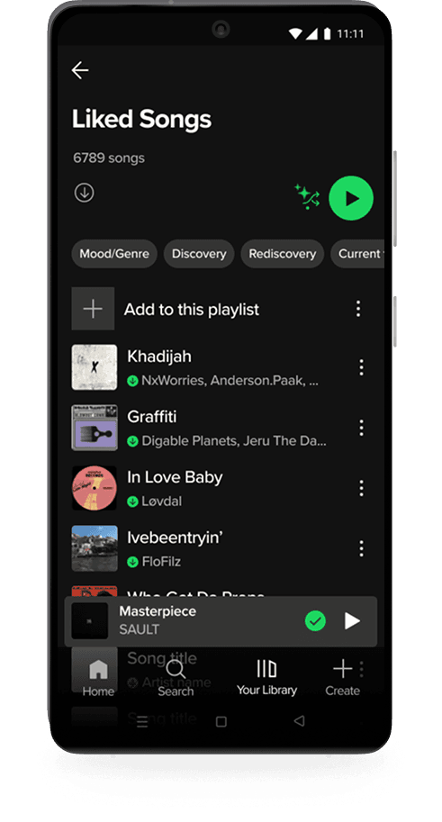
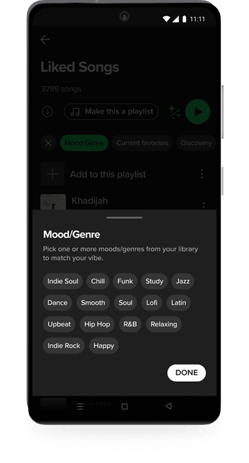
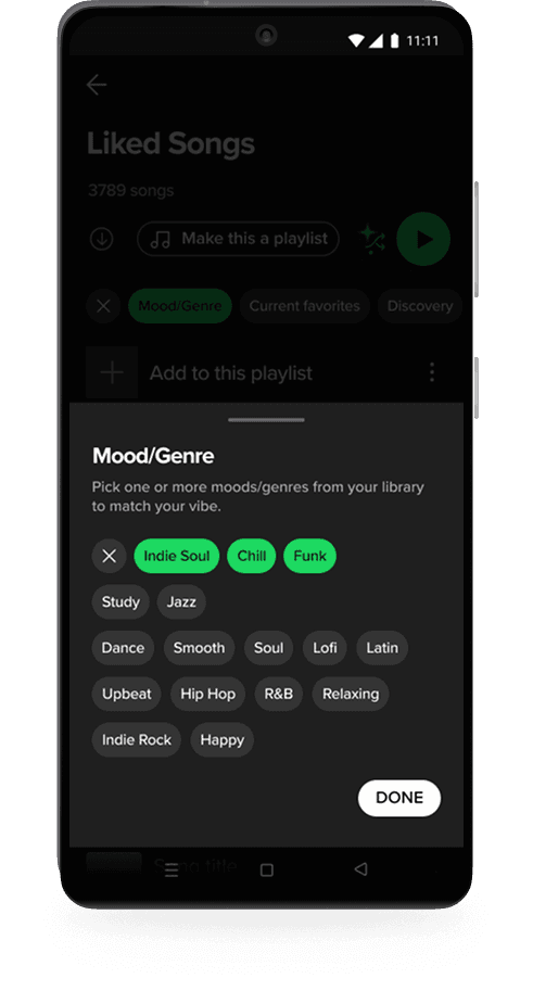
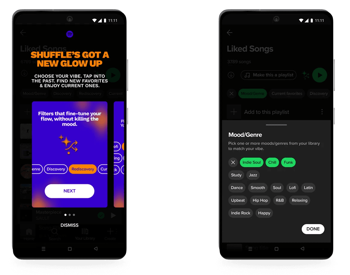
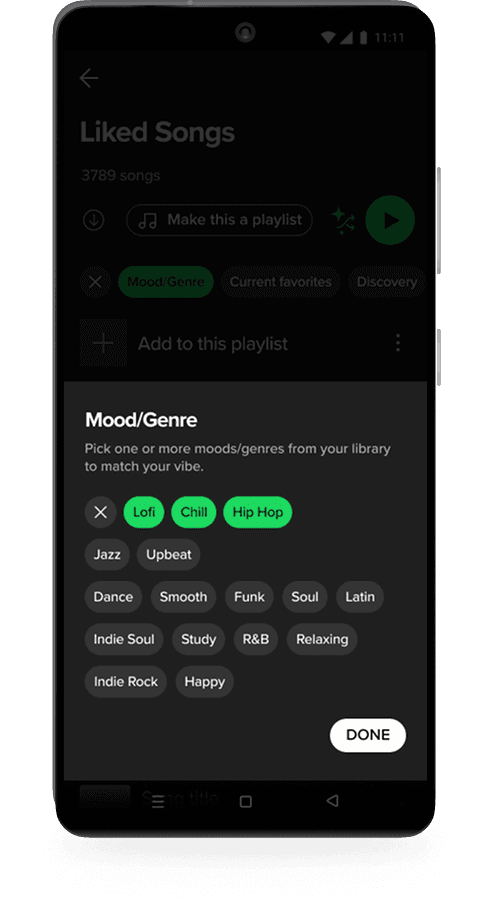
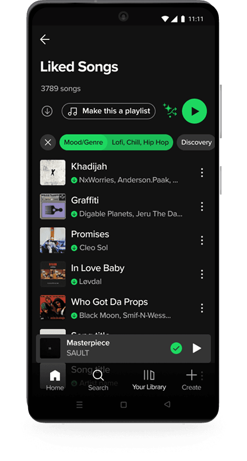
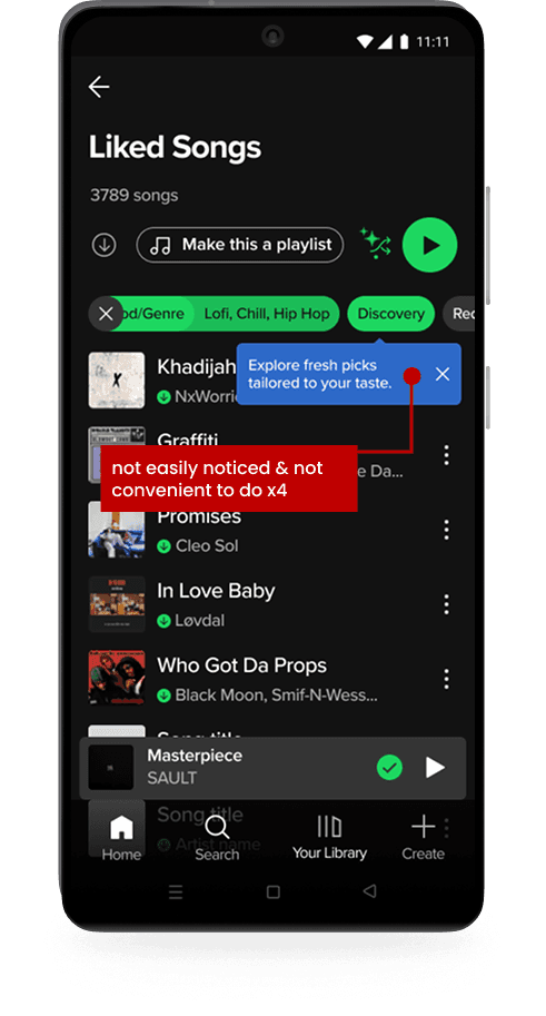
Users begin in their Liked Songs by tapping the updated Smart Shuffle icon, which is an evolution of the existing feature. Once activated, four filter options appear inline in a format familiar to Spotify’s UI. If users select Mood/Genre, a drawer slides up displaying the moods and genres already present in their library, allowing for multiple selections.
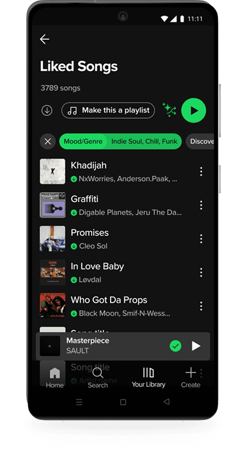
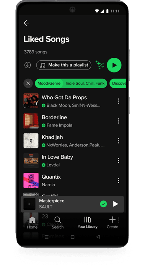
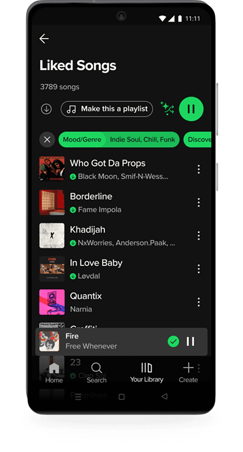
After confirming their choices, they can further refine their session with Discovery, Rediscovery, or Current Favorites. Each act as lightweight toggles.

problem
problem
solution
solution
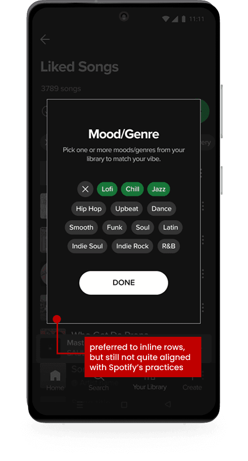
Mid-fidelity testing revealed the mood/genre filter needed refinement. A two-row inline layout caused confusion, while a modal view improved clarity for most users. To better align with Spotify's established patterns, a drawer interaction was implemented with visible applied tags for feedback and reassurance. In high-fidelity testing, all five participants reported the updated filter felt native to Spotify.
problem
solution

solution
solution
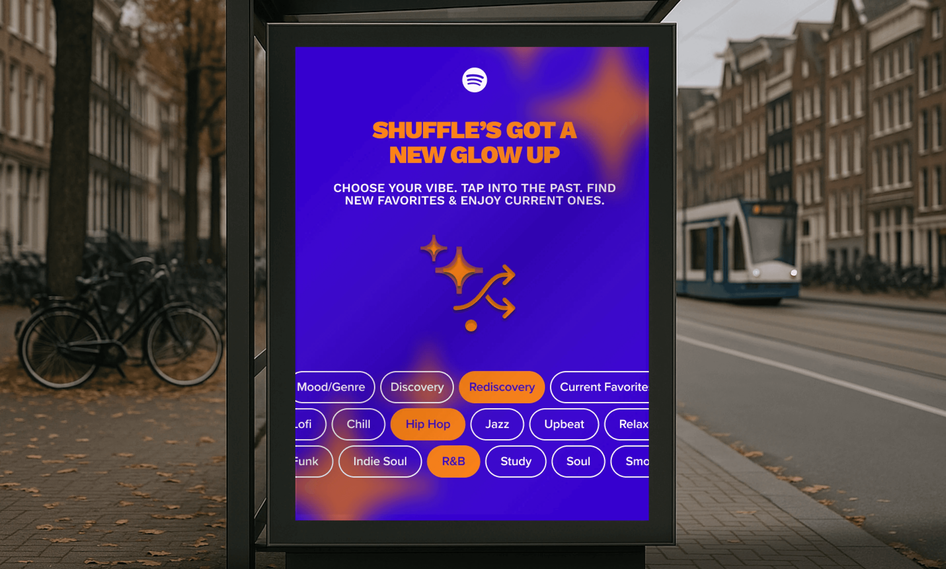
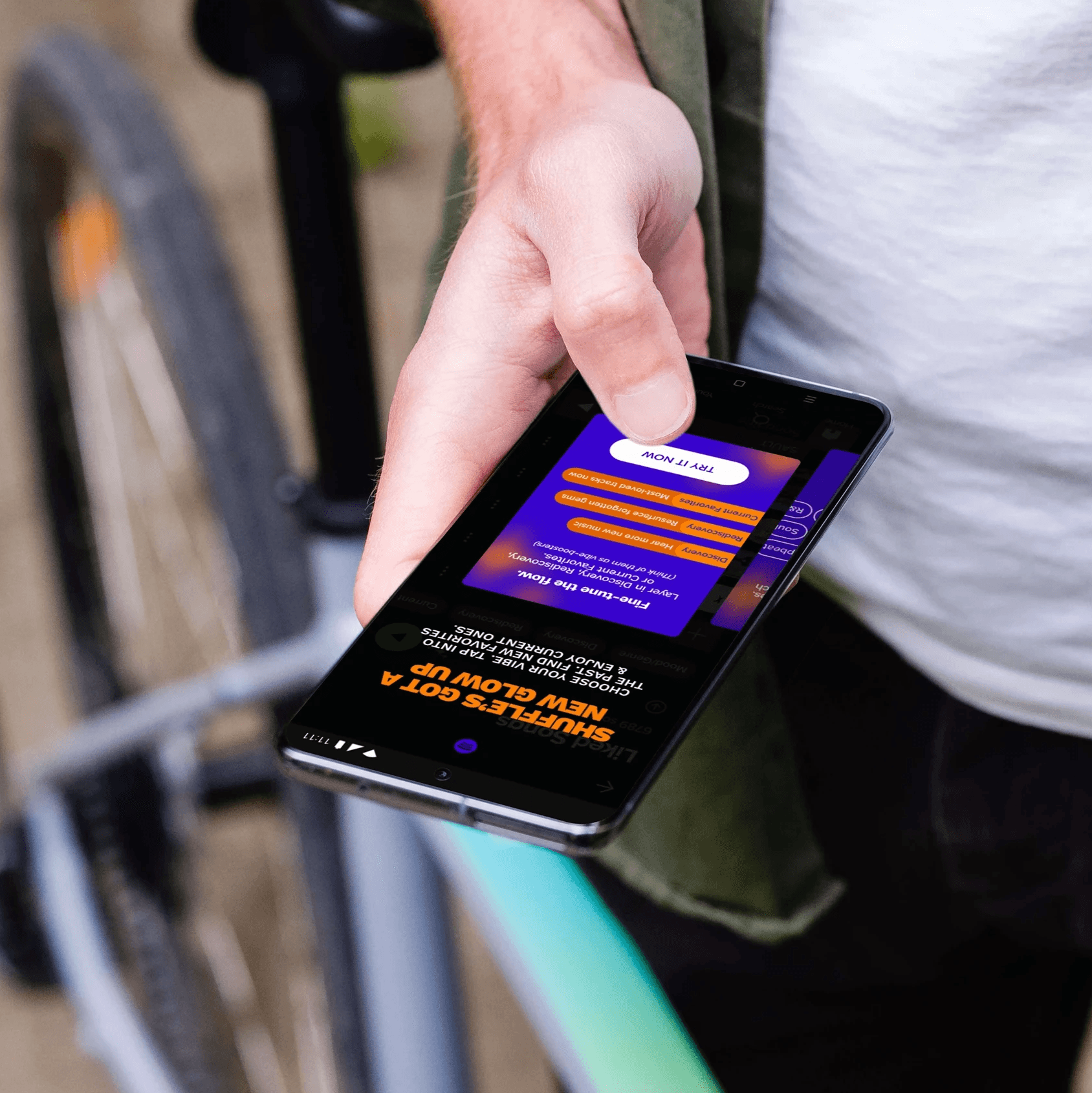
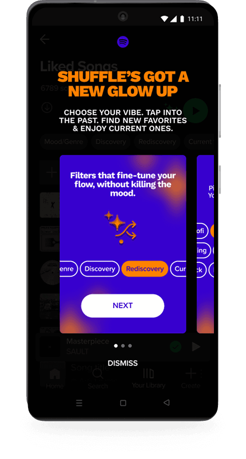
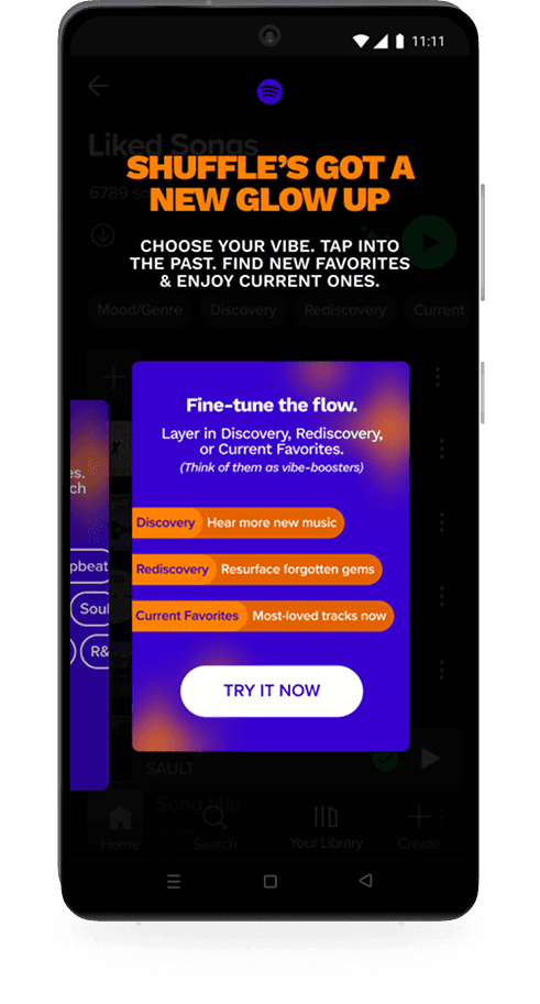
Tooltips were clear but passive for a feature that meaningfully expands Smart Shuffle. An onboarding carousel modal replaced them, using familiar card-based UI to introduce the new flow more intentionally.
100% of users noticed the new options after tapping shuffle and understood how to use Mood/Genre without guidance.
all participants praised the ability to select multiple moods/genres
users correctly interpreted filter names and purposes (100%)
80% independently understood that Discovery, Rediscovery, and Current Favorites refine within the selected Mood/Genre pool
5/5 users during high-fidelity testing reported they'd use the feature in real life, expressing strong interest in having more shuffle control
several participants noted they would use shuffle more frequently if this feature existed
Smart Shuffle Filters enhanced personalization by reducing repetition, supporting rediscovery, and giving users simple, meaningful control over their listening experience. Testing showed it felt intuitive, native to Spotify, and aligned with how users want to listen.
view prototype
Designing within Spotify's existing system was less intimidating than expected. Adopting their UI meant faster decisions and a smaller drawing board. The real challenge was designing a feature worthy of a highly polished, high-expectation product, and ensuring it would be technically feasible within what Spotify had already built rather than requiring significant new development. The hardest design problem was consolidating four filter concepts into one cohesive feature that still felt simple and native. An early version displayed multiple rows of options directly on screen, but it took up too much real estate and felt clunky. Users already have high standards for Spotify. It needed to feel like it had always been there. The modal vs. drawer decision came from testing, where users felt something was off with the modal interaction but couldn't articulate why. Going back into the app myself made the answer clear: modals are used for onboarding new features in Spotify's UI, while drawers are used for selections. A small distinction, but the kind that separates something that feels native from something that doesn't.
This project strengthened my ability to design within an existing system and make new features feel native rather than bolted on. Working within Spotify's constraints was clarifying rather than limiting. It narrowed the decision space and pushed me toward solutions that had to earn their place. I learned to balance user needs with technical feasibility, and that early research is the difference between designing something users want and designing something that sounds good in theory.
I can improve by validating ideas earlier and stress-testing feasibility at the concept stage. Recruiting testers sooner and anticipating system constraints upfront will help me move faster and design more strategically.


